
Allison Fewtrell

Allison Fewtrell (allison.imperisys.co.uk) is a design and branding specialist who has produced work for IER, CTUF and other organisations on... Read more »

Why visual identity is a question of power for the labour movement, and why getting it right matters now more than ever.
 4 Sep 2026|
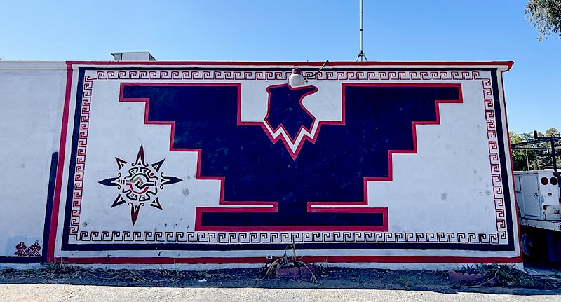
When farm-worker organiser Cesar Chavez explained why the United Farm Workers chose an Aztec eagle for their flag, he put it simply: a symbol gives people pride, and when they see it they know it means dignity. His brother Richard had deliberately simplified the image, so that any member could copy it onto a homemade flag themselves. This tells you almost everything about why design matters to a movement: an image can carry the dignity of a struggle, and ordinary members should be able to reproduce it.
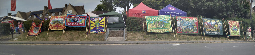
It is a lesson British trade unionism learned long ago. The banners carried at the Durham Miners’ Gala were never mere decoration. They were declarations of identity and intent, carried through the streets so a whole community could see itself made visible, dignified and strong. The labour movement has always understood, somewhere in its bones, that how you appear is part of how you organise.
Established unions have largely kept faith with that knowledge. But across the wider movement, design is too often treated as an afterthought. In newer campaigns, community organisations and grassroots groups that have multiplied in recent years, it can be a logo run up at the last minute, a different look for every leaflet, a colour scheme that changes with whoever happens to be at the keyboard. The instinct behind that neglect is understandable. There is a deep suspicion of “branding”: the word smells of marketing departments, corporate spin and everything the movement defines itself against. But that suspicion gets the relationship the wrong way round. Branding, marketing and visual identity are tools, and they are powerful precisely because capital has spent a century perfecting them. To refuse to use them is not principled restraint; it is unilateral disarmament. The task has always been to take those tools and turn them to our own ends.
That matters more now than it has for years. The far right in Britain is mobilising, and it does so with an alarming fluency in image and emotion. Its messaging is simple, repetitive, visually consistent and engineered to travel. Consider the “Operation Raise the Colours” campaign that spread across England from the summer of 2025: the St George’s cross is no far-right emblem in itself, yet repeated on lamppost after lamppost, and painted across mini-roundabouts, it became a single wordless message that needed no explanation and could be copied by anyone with a flag or a tin of paint. Its main organisers were linked to established far-right groups, though its reach owed less to them than to how effortlessly the image travelled. The movement is competing for the same attention, often the same working-class audiences, sometimes the same streets. We will not win that contest with worthy blocks of text and a different logo on every flyer. An organisation that looks fragmented, amateurish or unsure of itself concedes ground before it has said a word. One that looks coherent, confident and unmistakably present makes an argument about its own strength before the argument has even begun.
This is, at root, a point about memory. Ideas have to stick in order to travel, and design is one of the main reasons some lodge in the mind while others evaporate. Think of “Coal not Dole” during the 1984-85 miners’ strike: three words and a plain enamel badge that spread out from the South Wales and Yorkshire coalfields across the entire country, pinned to lapels far from any pit. The strike itself ended in defeat, yet the emblem endured, and still summons that solidarity four decades on, precisely because it was simple, distinctive and easy for anyone to reproduce and wear.
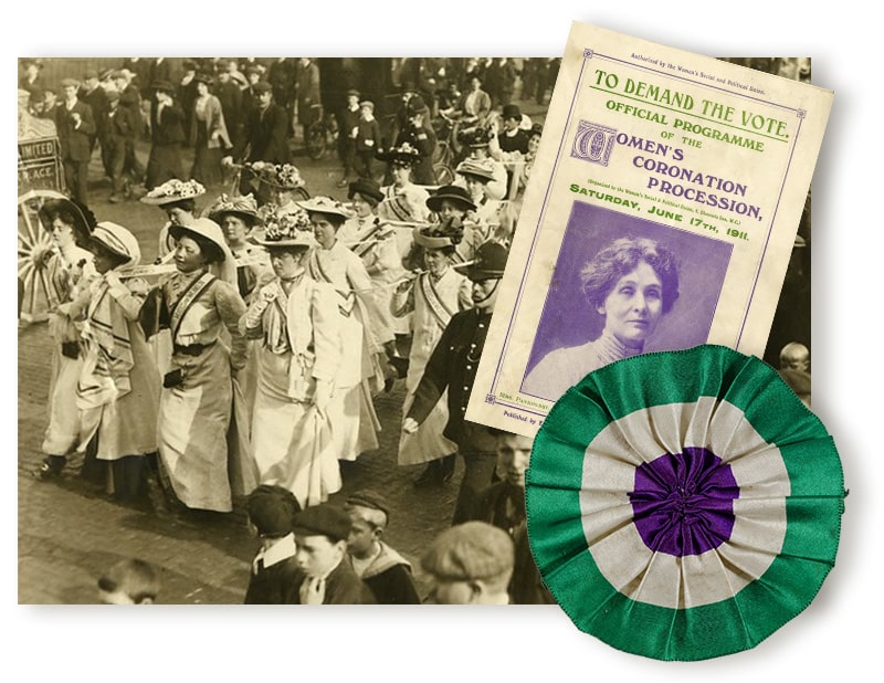
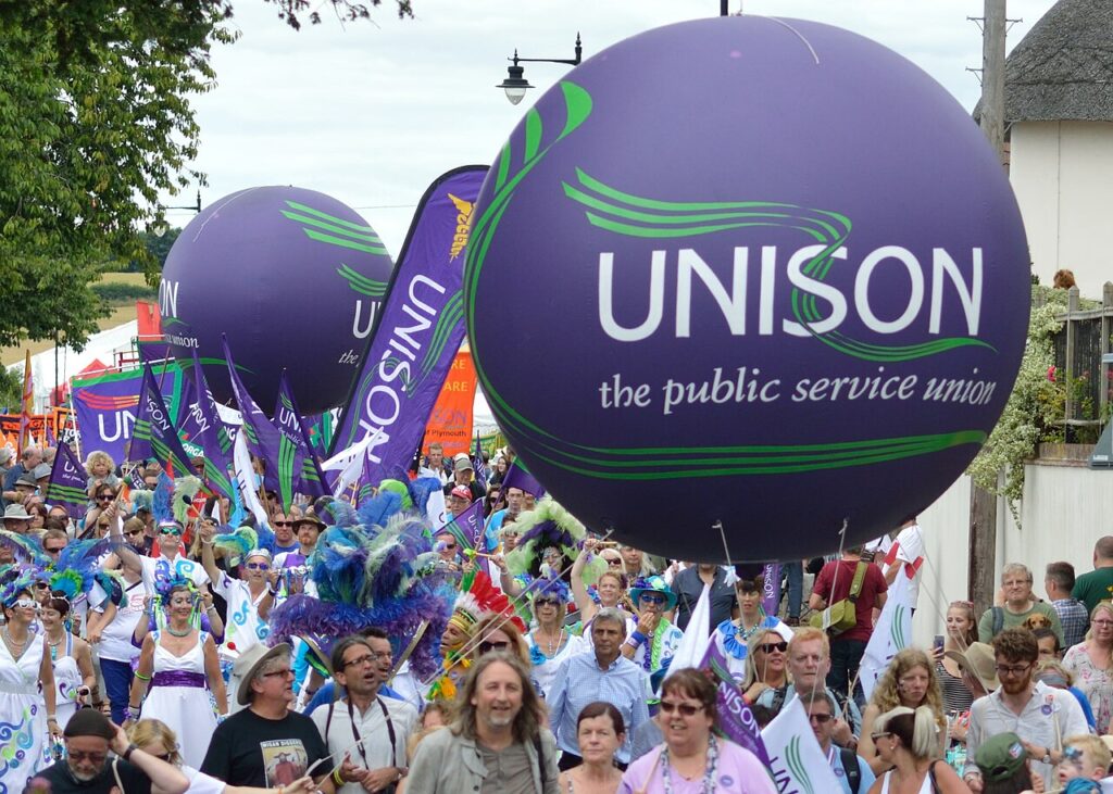
The strongest movement design shares those qualities. Think of the suffragettes’ near-military discipline with purple, white and green, a scheme so consistent that a sash alone could signal the entire cause. And look at the trade unions today, which understand this as well as any organisation in the country: a single, recognisable identity, whether UNISON’s purple and green or Unite’s bold red, held steady across hundreds of branches, so that the name on the banner changes from branch to branch but the union behind it is unmistakable. The branch is local; the identity is shared. That is not an accident, and it is not a constraint on local life. It is discipline in the service of solidarity, and it is exactly why a union is recognisable on a picket line or a high street before a single leaflet has been read.
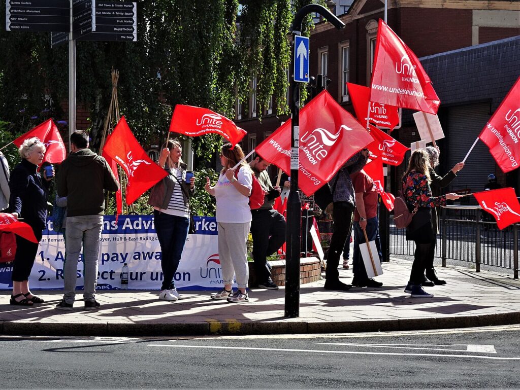
There is a real tension implicit here, and it is worth naming. Trade unionism is democratic and federal; branches and regions value their autonomy, and they are right to. A shared visual identity can sound, to the wary ear, like centralisation creeping in through the back door. But the unions themselves show how readily the two are reconciled. Branches own their content, local knowledge and priorities; the shared identity is simply what lets all of that local work register as part of something larger than itself. The lesson is there for the newer and looser parts of the movement to take up: a common identity is not the enemy of local autonomy but the very thing that translates it into collective strength.
Good, considered guidelines don’t constrain people; they free them up. They lower the barrier to producing strong material, so a busy organiser can put out a confident leaflet in an afternoon instead of agonising over typefaces. They mean that the movement reads as the same trusted body wherever someone meets it: on a picket line, in a social-media post, in a letter to an employer or a landlord. To those on the other side of the table, that coherence is itself a message: the same scrutiny and resistance will follow wherever they go. Recognition like that is hard-won, and very easily squandered.
The labour movement does not need to learn to love marketing. The best of it never forgot the older truth: that a banner, a badge, a colour or a well-made symbol is itself a form of power. At a moment when the other side is organising its image with such discipline, the task is not to discover this for the first time but to hold our nerve and keep getting it right. That is not a vanity. It is part of the fight.
____________________________________________________
Allison Fewtrell (allison.imperisys.co.uk) is a design and branding specialist who has produced work for IER, CTUF and other organisations on the left.
Allison Fewtrell (allison.imperisys.co.uk) is a design and branding specialist who has produced work for IER, CTUF and other organisations on... Read more »









Trade union law has to reflect the reality of our complex working lives